Your Designers (0)
Close (X)
Loading
Close (X)
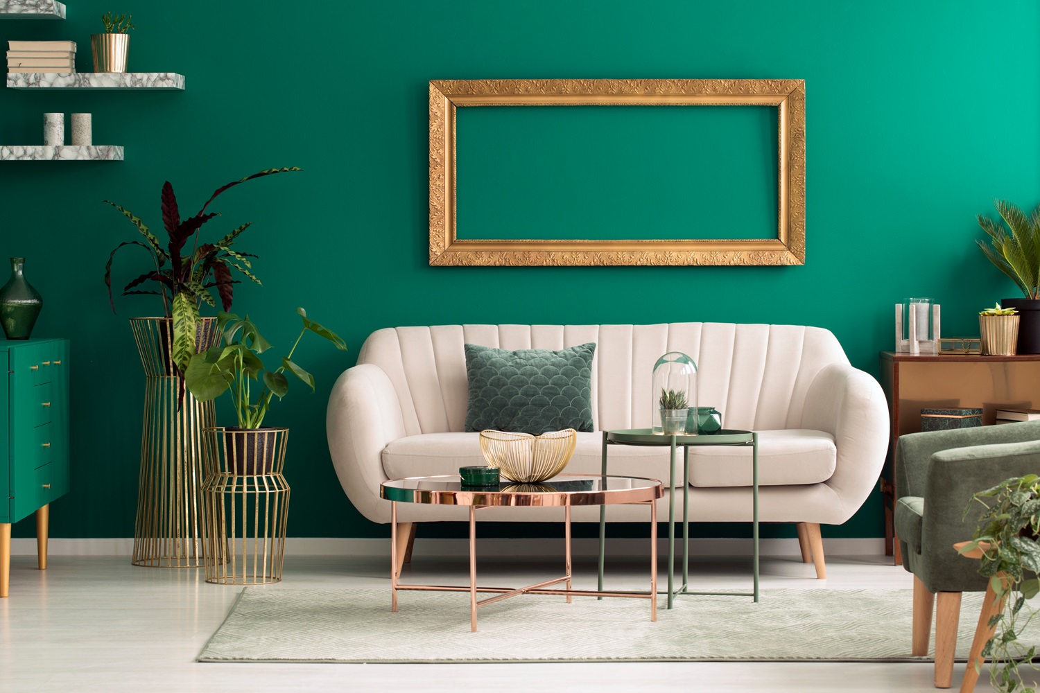
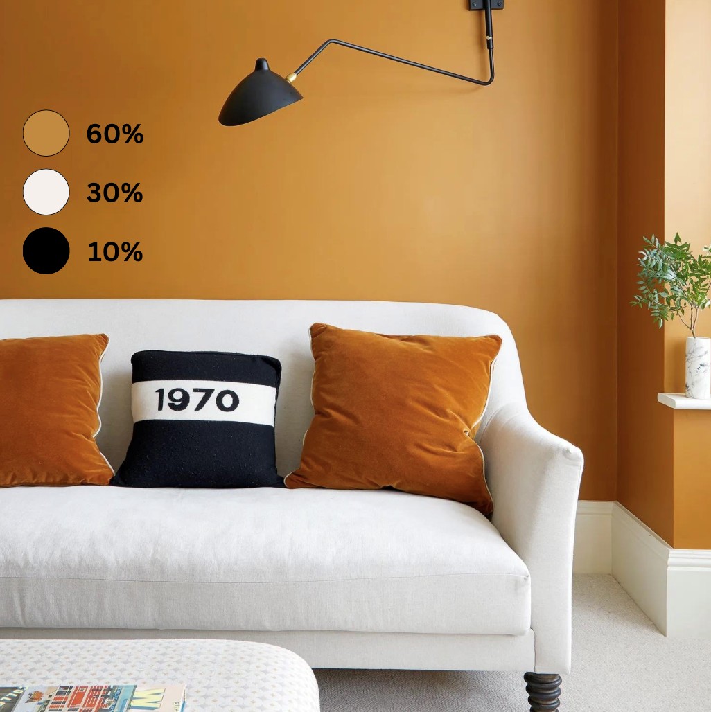
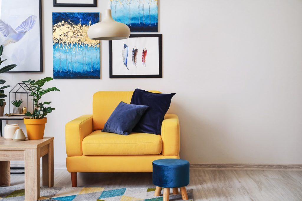
The beauty of the 60-30-10 rule lies in its simplicity – allocate colours using a ratio of 60%, 30% and 10%, respectively. Here’s how it breaks down:
60% dominate colour
This colour takes centre stage and sets the overarching tone for the space. Whether it coats the walls or dominates through key furniture pieces like sofas, bed headboards and area rugs, this colour establishes the room’s primary aesthetic.
30% secondary colour
The secondary colour plays a supportive role and complements the dominant hue. It helps bring depth to the space, adding contrast without overpowering the dominant colour. You’ll often see secondary colour used in accent furniture like statement armchairs, as well as bed linen, window coverings and drapery.
Implementing the 60-30-10 rule begins with careful consideration of your colour palette. Start by selecting a dominant colour that resonates with the room’s purpose and atmosphere. Neutral tones are timeless and elegant, while bolder hues inject character and flair into your space.
Not sure where to start? Consider using a reference point to kickstart your 60-30-10 journey. For example, a beloved piece of art or eye-catching area rug can be used as inspiration for either the dominant, secondary or accent colour. You can then build the rest of your strategy around this preselected hue.
Next, choose a secondary colour that complements the dominant hue. This colour will add variety to the space while simultaneously creating balance and cohesion. Experiment with different colour combinations to find the perfect pairing.
Finally, pepper the accent colour throughout the space. These pops of colour add visual interest, helping to draw attention to different areas of the room and tie the room together. Be mindful of placement and distribution to build a well-balanced space.